5 Rules of Good Logo Design
What makes an efficient logo design? There are definitely some boxes that your logo should check off to pass the good design test.
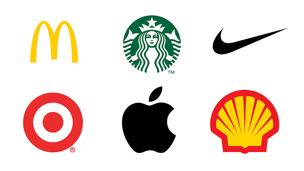
A logo is simply a stamp that represents your company specifically. Do you recognize these “stamps”? The main goal of your logo is to be a unique identifier of your business, and that’s it. I often get people saying that their logo should “wow” people. However, the purpose of a logo is not to wow people, but simply to identify who you are…sort of like your own name. Take Nike’s logo for example. There is nothing glamorous about it. However, it is a very unique symbol that is easily recognizable – mission accomplished.

Simple logos are remembered better than complex ones. Logos with simple, but strong gestures are more easily recognized. Simple logos reduce and enlarge much better than complicated ones (Would your logo still look good if it was engraved on a pen?)
Logos do not have to be overdone to be unique. When it comes to logo design, less typically achieves more.
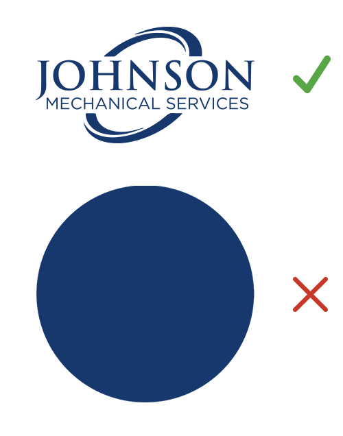
If your logo was painted a single color, would you still know it was your logo? This is definitely a best practice of logo design. Imagine that you became a sponsor of a 5k race, and the graphic designer needed to put your logo as a sponsor on the back of a T-shirt (and the shirt was going to be printed as a one-color job). Would the designer be able to work with the logo you send?
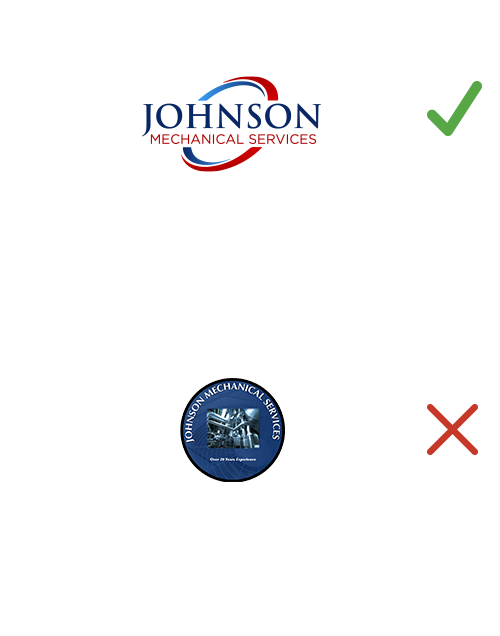
If you shrank your logo to fit on a postage stamp, would it still be legible? Your logo should be aesthetically pleasing in both small and large sizes, in a variety of mediums. A good rule of thumb is the “business card/billboard rule”: Your logo should look good on both.
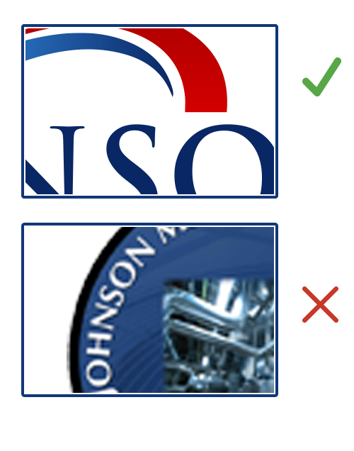
The first 4 “Your logo should” points were more about the design of the logo. This point is more technical. If you have your logo professionally designed, you should own the “vector” version of your logo as well. In many cases when I ask clients for their logo, they send me the jpg of their logo, which I can only use in a few cases. The format that I, as a graphic designer, really need is a vectorized logo, usually in a “.ai”, or “.eps” format. This way when I scale it up or down (depending on the application) there is no loss of quality.


